Over the past couple of years I’ve experimented with geometric shapes on furniture. While not every piece of furniture needs a daring design, it’s fun to take risks and try something more out of the norm. From bold to understated a geometric pattern adds a design element to common furniture that can take a makeover from standard to eye-catching. Here are 5 unique geometric-style designs to give furniture a sharp new look.
*If you want to know how I get perfectly paint clean lines read this post.
1. All-over Design.
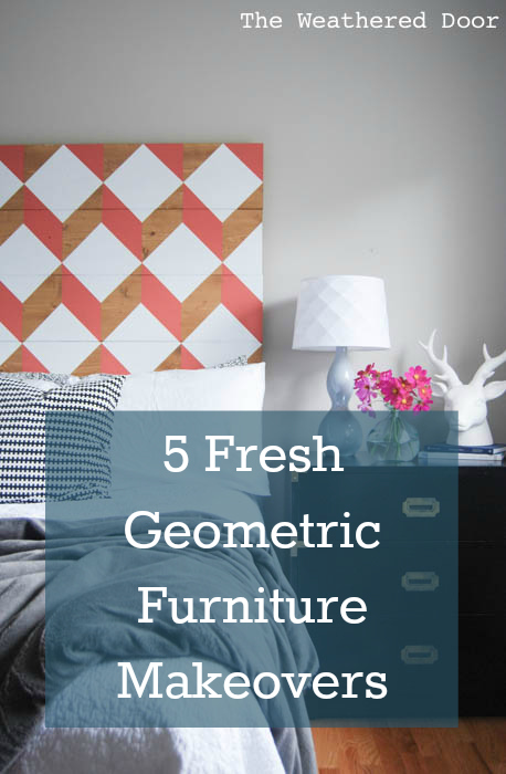
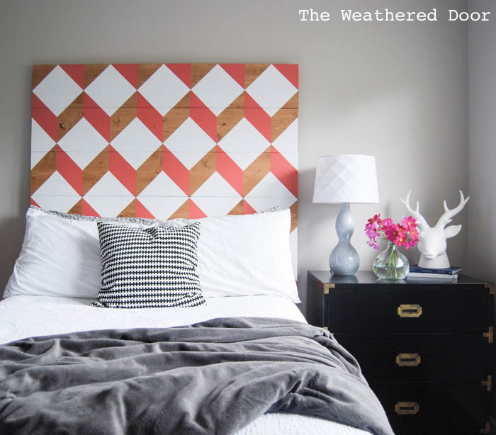
For a bold look I built and painted a coral geometric headboard that was a knock-off of an Urban Outfitters item. This statement piece is not for faint of heart, it draws attention right when you walk into the room. The natural wood, crisp white and lively coral combine to bring a fresh yet warm fell to this headboard.
2. Understated.
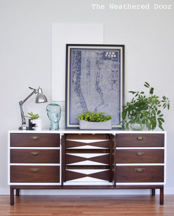
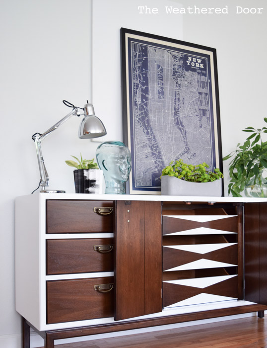
I was going for a more simple and fresh look on this Broyhill high gloss credenza and so in order to let the white and wood be the main focus I only added a design to the 3 interior drawers. Using the same dark walnut and high gloss white combination keeps the whole piece feeling cohesive.
3. Dimensional.
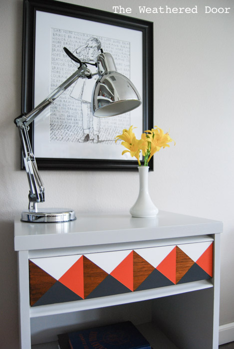
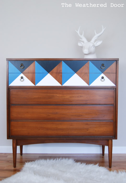
Mid century furniture was created in a variety of designs, the most common being flat and simple lines, but there are highly collectible pieces with 3D elements like the Broyhill Brasilia line. Instead of having to shell out the hundreds or thousands of dollars for one of those spectacular pieces a similar dimensional effect can be created with paint and/or stain. I love incorporating the original wood finish as part of the geometric design like in this orange geometric nightstand or this black and blue geo nightstand. Other times an all wood piece can get just a little bit of interest by just adding the design to the top drawer.
4. Angled.
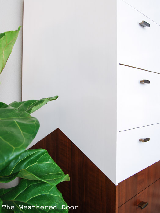
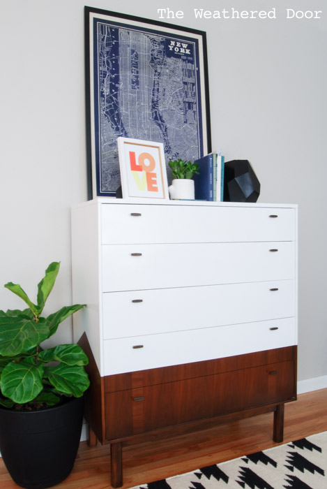
The angled sides on this highboy mid century modern dresser add an architectural-like element to an otherwise flat looking piece. The straight lines of the design mimic those on the piece, but when they are placed diagonally they create an angle which makes for a show-stopping side view.
5. Triangular.
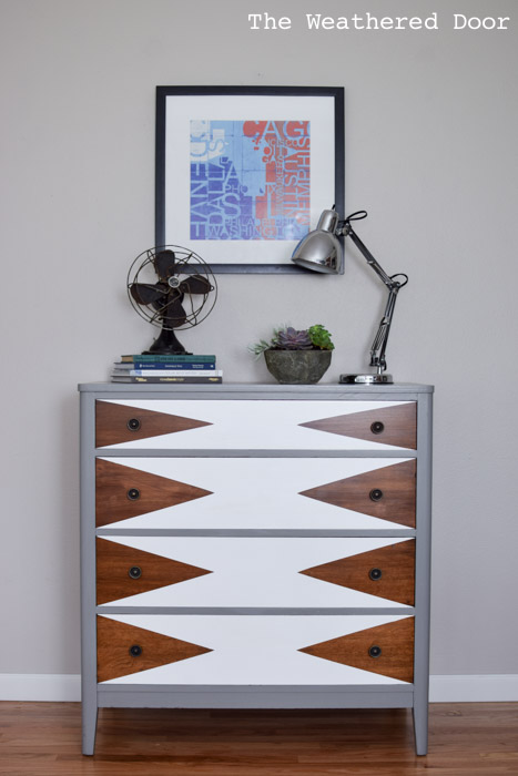
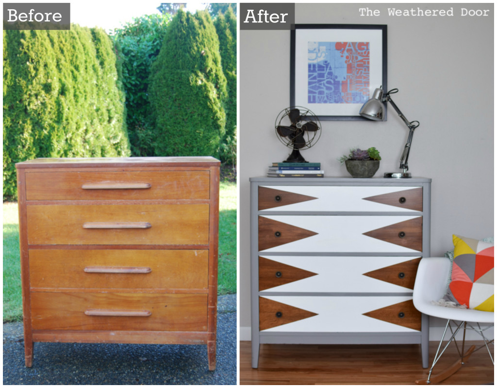
This typical, inexpensive wood dresser was dragging before it’s fresh new makeover. The mod triangle pattern gave this piece a completely new look, so much so that it is pretty much unrecognizable. The wood triangles that dart toward the center add so much more interest to a piece that before looked like a big wood box.
______________________________________________
You can find all of the geometric furniture makeovers I have done here. If you recreate any of these looks please give credit and link back online or tag me on social media. You can find me sharing more regularly here.
Instagram | Facebook | Youtube | Pinterest | Twitter
DIY. fearlessly.
Reeves
I love all your geometric painted furniture. I just did a piece that required lots of taping but the paint seeped and the lines were just not straight enough. I spent so many hours working on it but I am not completely happy with the way it came out. Thanks for sharing, you are inspiring me big time. Lilly 🙂
Definitely try the tip I shared. I really don’t get bleed through at all because of it.
I am so happy I came across your blog on pinterest. I see alot of geo pattern furniture however your designs are different and I love them!!!
Thank you! Thanks for stopping by!
Beautiful work. What finishing products do you use on the paint and wood? I’m doing a chest of drawers for the bedroom and just can’t get it right